DISCOVER AUTHORS YOU WILL LOVE, FOR FREE!
Get Free eBooks in your favorite genres

GETTING FREE EBOOKS AS EASY AS...
1
Provide your email address
2
Choose your Favorite genres
3
Check your inbox for personalized recommendations
ALL YOUR FAVORITE GENRES IN ONE PLACE
Free eBooks delivered right to your inbox
BROWSE BY GENRE

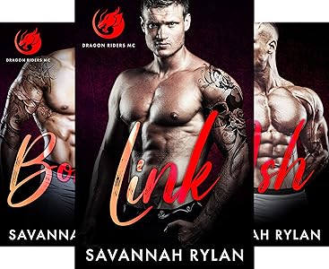
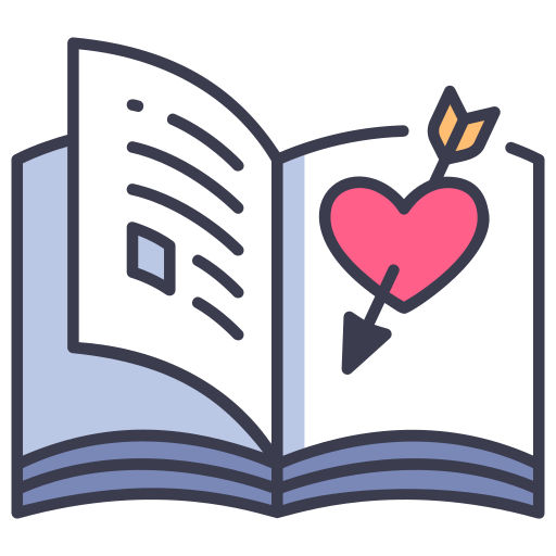 Romance

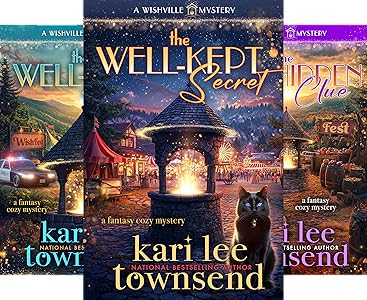
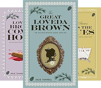
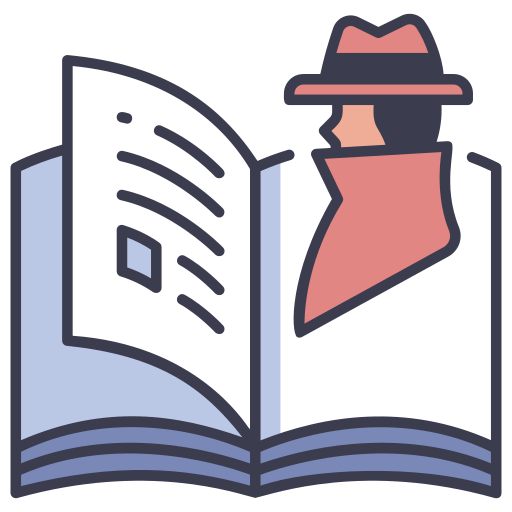 Mystery

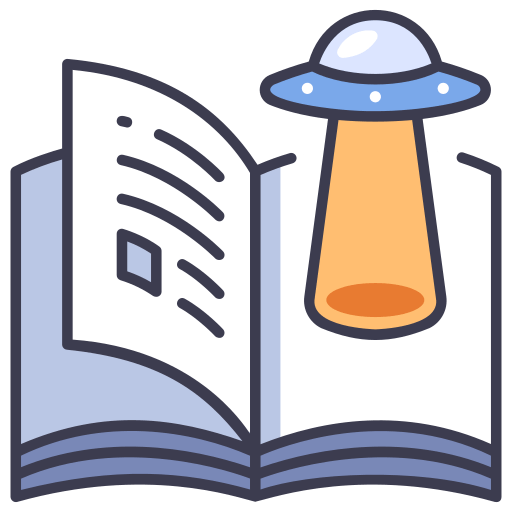 Science Fiction

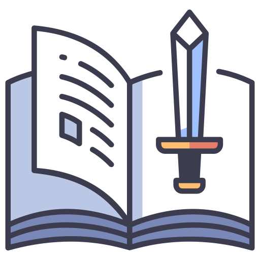 Fantasy

 Literary Fiction

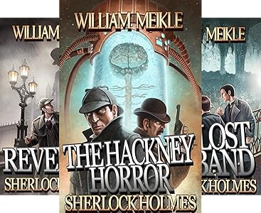
 Horror

 Non-Fiction

 Children's

 Cookbooks & Nutrition

 Self Help & How-to
Today’s Featured Free eBooks
Free First in Series


Other Free eBooks

Deals of the Day
-
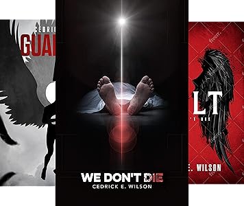
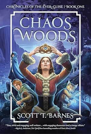 Fantasy / Paranormal
Chaos Woods (Chronicles of the Ever-Guise Book 1)
-
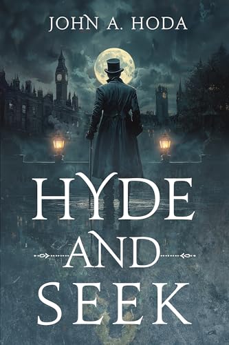 Thriller
Hyde and Seek (A Jekyll & Murphy Mystery Book 1)
-
 Science Fiction
Klandor Rising: The Complete Series
-
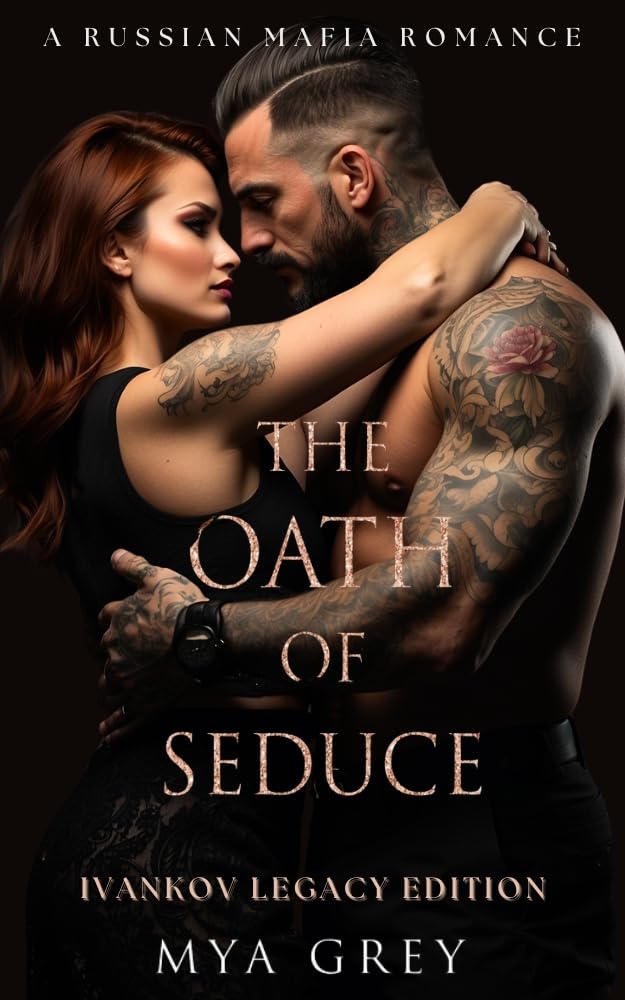 Steamy Contemporary Romance
The Oath of Seduce (Ivankov Legacy Special Book 1)
More to Explore


SIGN UP TODAY
Join thousands of
happy readers

★★★★★
It just doesn’t get any better than Freebooksy if you love to read!
Cindy
reader
★★★★★
OMG I love this! I look forward to it every morning.
Patricia
reader
★★★★★
Very Streamlined service, helps me tremendously! is the best used book store!
Jessica
reader
What is Freebooksy?
The best books in life are free, and we know where to find them. Freebooksy empowers readers like you to read more for less by finding and sharing hundreds of Amazon Kindle and other free eBooks to read every week. At Freebooksy, it’s our goal to never let your budget stop you from doing what you love: reading.
We’ll help you find your new favorite author or series without spending any money by sharing free eBooks on our social media feeds and website.
Plus, we deliver a free, curated, personalized list of eBook downloads to your email inbox daily! Whether you’re looking for Amazon Kindle books, free Nook books, Kobo books, or free Apple books, you’ll never go a day without reading again.
Free eBooks Delivered Straight to Your Inbox
At Bargain Books we know there’s nothing quite like getting lost in a new book. We also know how frustrating it is to search online for hours trying to find cheap eBooks to read and eBook downloads that actually work. That’s why we created Bargain Booksy.
Bargain Booksy makes it easy for you to discover discount eBooks in your favorite genre regardless of your budget. We find free eBooks we know you’ll love and send them your way.
Free Amazon Kindle eBooks and Much More
We make it easy for you to build up your personal library without spending a dime. Find free Amazon Kindle eBooks from your favorite authors and capitalize on a no-risk chance to discover your next favorite indie authors too.
Why Freebooksy?
• Get dozens of free eBook downloads in your genres of choice sent directly to you every morning!
• Choose from multiple book types, including Amazon Kindle eBooks, free Apple books, Kobo books, free Nook books, and more!
• Personalize your free booklist with over 20 genres of eBooks available!
• Spend less time searching for free eBooks to read and more time reading them!
Whether you’re looking for Amazon books online or Kobo books, reading just got more fun and way less expensive with Freebooksy!
Free eBooks for Every Reader
Like you, we are avid readers who love diving into a great book and getting lost in the story page after page. That’s why we’re dedicated to helping you find free eBooks to read in your favorite genre. With device and genre preferences seamlessly integrated into your personalized book selection, finding Amazon Kindle eBooks is easier than ever.
With Freebooksy, you’ll find all your favorite genres in one place and always free, including:
- Romance/Chick Lit
- Mystery/Thriller
- Fantasy/Paranormal
- Non-Fiction
- Young Adult
- Science Fiction
- Literary Fiction
- Religion/Spirituality
- Children’s
- Horror
Long gone are the days where you have to filter through the massive volume of free Amazon Kindle books to find something you’ll enjoy. We search everywhere for free books so you don’t have to and deliver eBook downloads straight to your inbox every day. Sign up for Freebooksy today for free books you’ll love at a price you’ll love even more… FREE!
Discover More eBook Savings With Our Partners:
eBook deals priced $0.99-$4.99
Discounted audiobooks
Free & discounted romance
Weekly new releases